Medical communications lessons learned from the London Underground map
Even though I grew up in the UK, I was only recently made aware of the history of London’s Underground map. It is a fascinating story of an electrical engineer who identified a market problem and understood how to meet it with good communication.
Here it goes:
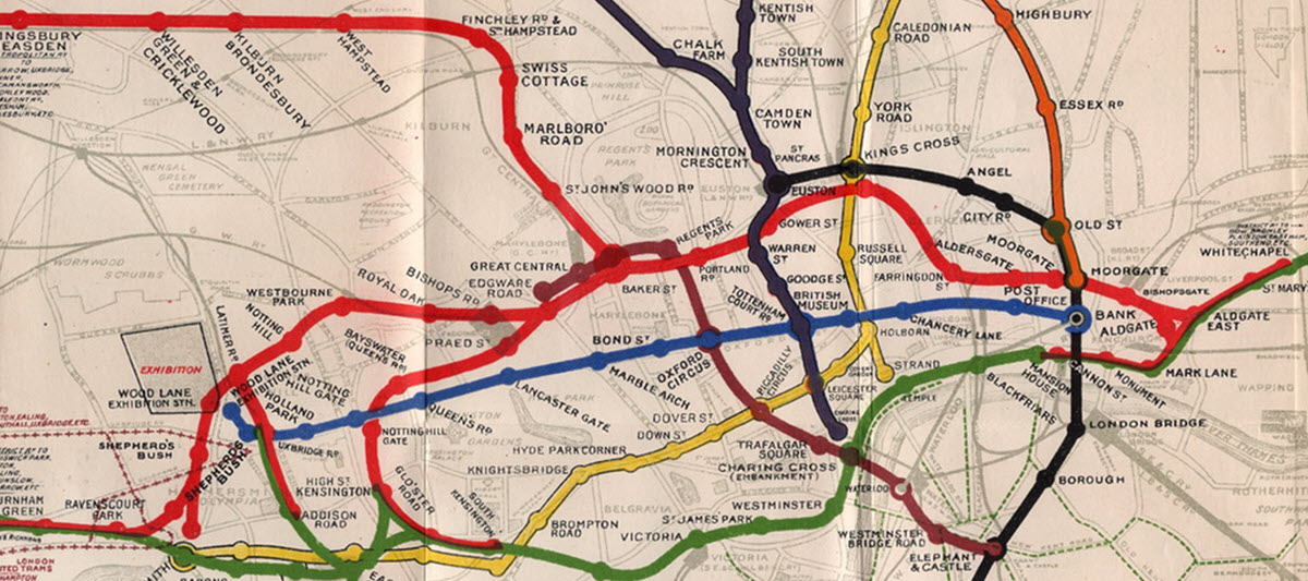
In the early 1900s, the London Underground created a map that was extremely complicated and hard to follow. The reason? It mapped the exact geographical path that the trains followed.
It was a mess, which you can see here (credit):

Harry Beck was an electrical engineer who worked for the London Underground. He had a brilliant idea. He understood that people traveling underground do not care about what is happening above ground. What is important to them is to receive clear instructions about how to navigate most efficiently from one place to another.
So he redrew the map creating lines in only three directions, spacing the stations in equal distance from one another, and the names of the stations were all made vertical, making them more legible. The result was something that is not really a map, but a diagram guide small enough to fit in your pocket. In the 1930s the Underground decided to give the map a try. It was immensely successful. And this map style is the same one that is used today. Not only in London but for virtually all transport systems in the world.
Here’s what made the map a success:
Targeted – The map provides just the relevant information to an audience with a specific need – navigate within the complex infrastructure of the Underground. Are you spoon-feeding doctors with only important and relevant information? Or are you instead bombarding them with everything that you know?
Simple – The map is extremely easy to follow. Are your instructions in site initiation visits, Instructions for Use or other communication materials clear and simple to understand?
Clear – Lines are clearly marked in bright colors, and the stations and junctions are easily recognized. Is your roadmap clear for physicians and investors? Are they informed about the stops that need to be made along the way?
Geometrical – Straight and parallel lines, plus alignment of objects, register better with viewers, giving them a sense of professionalism. A geometrical arrangement sends the message of structure and order that makes sense. Have you remembered to align elements in your investor deck, clinical slides, or on your website?


